Hey gang!
One of the most often-asked questions throughout the migrations to the Unified Community Platform (UCP) has been, “what will the new design be for the platform?” That’s what we’re going to dig into today. You’re going to see what the new FandomDesktop experience looks like. You’re going to see what this project is and is not, the kinds of feedback we’ve incorporated, where we’ve drawn from lessons learned on both Fandom and Gamepedia, and what the different experiences for readers and logged in editors are.
A few weekends ago at Community Connect, one of the commitments we made is that “more is more.” More transparency. More context. More candidness. More information. This blog is really long, but it’s an effort to deliver on that commitment now and in the future. And I’m really excited to dig into these designs with you. I’m not just saying this because I work here—I’m incredibly excited about FandomDesktop. It’s a modernized look and feel for Fandom, with really important elements brought over from Gamepedia. In fact, there’s one particular piece of information later in this blog that is the most exciting announcement that I’ve ever been able to bring to you. So I’ll call that out when we get there.
Wait, wait, wait. You just did UCP. Now you’re changing the design?
Good callout, we should probably back up a bit and reset some context after a long UCP process. When we announced the UCP, we said there were two phases—the technology (aka how the platform works on a technical level) and then the look and feel of the wikis themselves. So far, most of our focus with you has been on that first phase. After all, when you’re building a car, you have to make sure the engine is running well before you worry about how to paint the frame.
Over the last few months, we’ve all but completed the migrations to the UCP and are close to closing the door on the legacy platform. We’ve taken a big whack at fixing key quality of life bugs over the last 2 weeks, and you’ll be happy to hear that, moving forward, a more sizable chunk of our development teams’ time and resources will be focused on constantly improving existing and new features, improve the “quality of life” for all users, and operate a platform that has fewer and fewer bugs as we move forward.
We’ve also transitioned all Gamepedia wikis and, so far, 30% of Fandom wiki traffic to the new FandomMobile skin, the first phase of our new unified mobile experience.
Now it’s time for what’s on everyone’s mind: what the new and unified design will be on desktop for Fandom and Gamepedia wikis. After all, while many of you use the mobile experience as well and while mobile does account for the majority of our traffic, wiki editing and maintenance is generally a desktop experience. So it’s important that we get FandomDesktop right. It may not be the majority of traffic, but it’s certainly the skin used by the majority of you who are the stewards and lifeblood of your community.
What is FandomDesktop?
FandomDesktop is the new unified look and feel of Fandom and Gamepedia wikis. That’s our eloquent way of saying it. Put more simply, it’s the site’s desktop skin. It’s been designed based on things we’ve learned from past experiments and previous attempts at changing the design of the platform. This isn’t the first time we’ve done this! But it’s certainly the biggest visual change that we’ll have made to Fandom’s look and feel since 2010, and we recognize that it’s going to be a big transition for Gamepedia wikis in particular.
It’s also based on years and years of feedback, both from casual audiences as well as admins and editors. That includes a number of recent studies. We’ve done three user research studies (two with editors, one with consumers), we’ve solicited feedback directly from the Community Council, and we heard feedback at Community Connect. Along the way, we’ve tested out a number of options, incorporated changes based on feedback, and further tested with all audiences to make sure the design reflects those insights.
The design also takes into account important elements of both platforms, but not all elements—if we tried to just combine the two distinct styles, it would probably be a Frankenstein’s monster that tries to appease everyone but ultimately pleases no one.
There are some key points that wiki admins/editors have said are important to them, and that the general audience has said is important to them. Let’s take a look at some of those:
| What Editors & Admins Say | What the General Fanbase Says |
| They’re anxious about change between Fandom and Gamepedia, with each one having clear elements of their experience that they would never want to lose. | They often don’t realize that individual wikis are all part of one platform. They arrive on the site from Google to find information, but don’t connect the brand. |
| They want to utilize more screen real estate, and many don’t like the fixed width experience on Fandom wikis. | Wiki content can often be long and difficult to consume, especially when looking for an answer to a specific question. |
| They love the ability to customize their wikis and take great pride in what they build and how they express their identity. | They like clean and consistent designs that are easy to navigate, and don’t like customizations that impact accessibility. |
| They want quick access to their editor tools and important links, and the ability to easily moderate and manage their wikis. | They often only visit one wiki and/or type of content during each visit, so not every tool or page is relevant to their experience. |
So taking that into account, we had to define the scope of what we were doing with FandomDesktop and our overall redesign project (which includes FandomMobile). Equally important to understanding what FandomDesktop is, is understanding what it’s not. Let’s take a quick look at that:
| What FandomDesktop is | What FandomDesktop is NOT |
| It’s a redesigned layout for wiki articles that includes consistent ad placements and content viewing so people don’t have to relearn how to use the site from one wiki to another. | It’s not introducing new types of content or creator tools. That’s next! We’ll have a blog on some of the new tools that you can expect very soon. We announced some of it at Community Connect and the reception was wildly positive. |
| It includes a unified global nav experience and local navigation experience for both Fandom and Gamepedia wikis, allowing users to easily find content on the wiki they’re on and across the entire platform. | It’s not implementing new search-related features, though there will be some incremental search improvements we can make as part of this project before tackling a better search experience longer term. |
| It’s a design that will be further married with the FandomMobile skin, with a new Theme Designer that will eventually apply to mobile (finally bringing mobile theming to Fandom wikis - something Fandom users have asked to have for many, many years.) | It’s not redesigning non-wiki pages like the Fandom home page, editorial content pages, or Discussions. A separate project to make some initial updates to the Fandom home page site will run in parallel. |
What does FandomDesktop look like?
Now that we’ve got all of the context out of the way, we can finally get to the fun part—what it actually looks like! I want to preface this by saying that we’re going to lead this blog with what the logged out / non-wiki editor experience looks like. That means you’re going to see ads in these mocks. You’re going to see things that might not be aimed at you. But we felt it was important to show you what the general audience will see first.
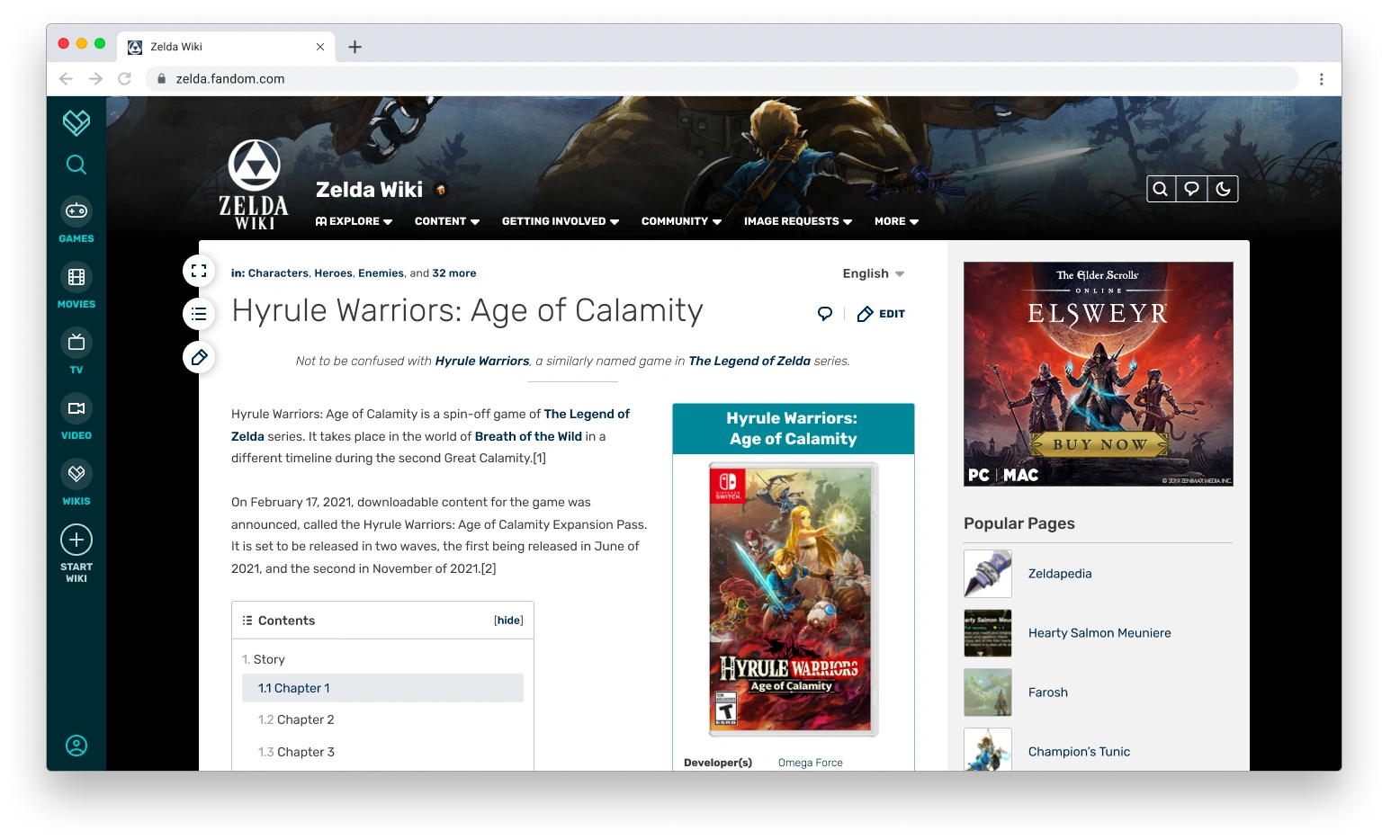
This is the experience fans will see when they first come to the site and aren’t logged in, generally after finding your wiki in Google search results. There’s a few things that I want to draw your attention to in this, before moving onto more mocks that will show more personalized viewing experiences.
- The global navigation experience. It wouldn’t surprise me if you pretty quickly noticed that the Fandom global nav bar is now on the left-hand side of the page, instead of the top of the page. We changed it for a few reasons. For one, with a global nav and advertisement at the top of the page, that’s more time it takes to actually get to the important part of the page: the content. So this change is able to free up some vertical space. Two, we’ve always had trouble getting people to click on anything we put on that top-level nav. With this new approach, we believe—and saw firsthand during user testing—that we’ll attract more eyeballs and thus lead to increased discovery of more content, especially once the Fandom home page also gets a revamp and becomes more relevant. Putting it on the left hand side, knowing that most of our audience reads from left to right, might make it more prominent to people. It’ll be interesting to see the results and compare to the top level nav. It’s also a nod to Gamepedia’s left-side navigation experience. We are looking at ways to leverage this global navigation to help drive cross-wiki visitation, which in turn brings more readers and potential new editors to your wiki.
- The local navigation experience. We also opted to use the existing local navigation placement from Fandom wikis in this new design. We know that the left-side navigation is important to a lot of Gamepedia editors, and as part of this process we explored dozens of potential layout options, using different combinations of global navigation and wiki navigation placements and how that interacts with the fluid width experience (more on that in a moment!). In the end, we found this design to be the most scalable, functional, and modern approach for us to build from. More on that in a few moments.
- The header image. One of the things we were able to do with this design is remove the solid color header from the local navigation, and replace it with a more personalized background header. Not only will this allow for deeper immersion into the wiki’s subject, but it allows communities to move their personalization up higher in the overall page, thus setting the tone right from the start after the page loads. Although this will be the design that our new Theme Designer will support, wikis can add a full background via CSS if they so choose.
- Fluid width. On the left-hand side of the content space, you’ll see a button with a double-sided arrow. We’re also taking another page from Gamepedia’s book with a fluid layout accessible to all users. No matter the device or browser size, your content fills up more of the screen for anyone who wants to expand the width of the page. This provides more screen real estate than what is currently allowed on Fandom and more than what logged out Gamepedia users generally see on most screen sizes.
- The Gamepedia legacy badge. As promised, wikis which came from Gamepedia will have their Gamepedia heritage honored as part of this new experience. This is our current idea for indicating that status as an OG Gamepedia community. The flame and book logo would live in the header next to the wiki’s name and would be toggled by a staff setting, so that only Gamepedia legacy communities can get that honor. The logo would be clickable to reach a page on Community Central immortalizing Gamepedia’s legacy and history. We would love your feedback on this approach and the design of it.
What does FandomDesktop look like as you scroll down the page?
Great question! The top of the page is incredibly important, but let’s not forget about what the site looks like as you scroll into the heart of the page and start digging into the content. As audiences start looking for information, it’s important to us that all navigational elements remain within reach so they can quickly jump through the page, the wiki, or Fandom as a whole.
Here’s a mock of what that looks like:
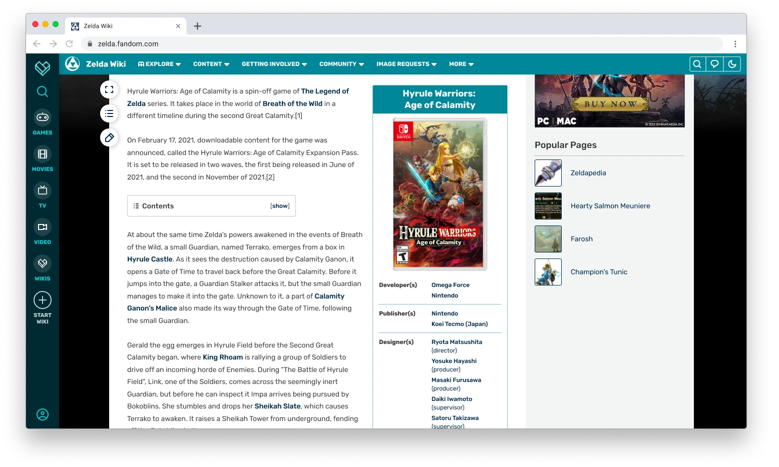
Let’s talk about some of the key elements here:
- Search is always at your fingertips. You can see how we start to retain access to tools on scroll with search being visible on the left-hand side of the page. That was already the case with Fandom wikis, with a fixed global nav bar, but not the case with Gamepedia wikis. So this becomes consistent across all communities so people can quickly search for more content.
- The local navigation scrolls with you. When you scroll down the page, the local navigation will collapse in size and follow you down the page. That way, readers are always able to access the important links that you’re providing for them. I mentioned before how we tried many different navigation designs, both on the top and on the side, and the ability to have this scroll with you is a big part of why we landed on this design instead of having it on the left. That wasn’t possible on Fandom wikis (local navigation is fixed to the top of the page) nor was it possible on most Gamepedia wikis (where the left navigation could be as long as you wanted, which required scrolling to see all of the links and therefore couldn’t remain fixed). This is also part of why the global navigation is on the left, so there aren’t two navs stacked at the top.
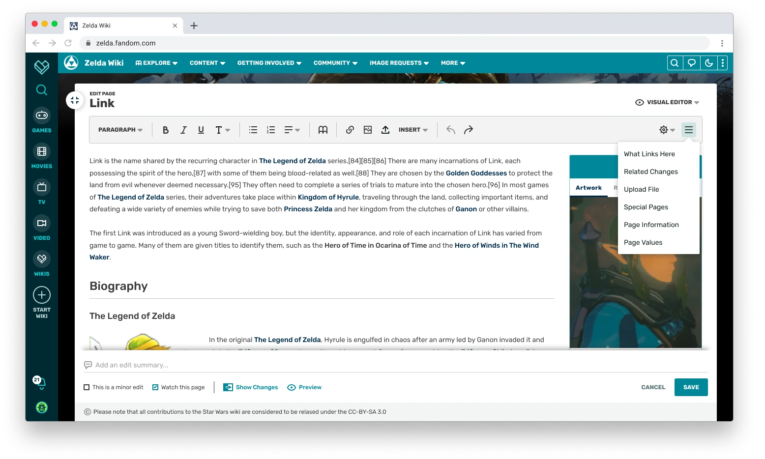
- Links for easy access to tools. You’ll notice that there’s three buttons hovering over the left end of the content space. The top one is the fluid width toggle. The second button opens up a Table of Contents menu for the page you’re on. So while you’ll still have the Table of Contents in its usual place between the article’s introduction and the main body of content, you’ll also be able to access the Table of Contents regardless of how far you’ve scrolled down a page, allowing for easier page navigation. The third button is an Edit button that follows you on scroll. You’ll still have access to section editing throughout the page as usual, but this ensures that the full article edit view is easily accessed wherever you are.
Please tell me there’s a dark mode.
You asked, we listened. Dark mode has been available as a wiki-level option on Gamepedia for a long time, but it’s never been available on Fandom. That’s about to change as we add in more personalized viewing options. Check that out:
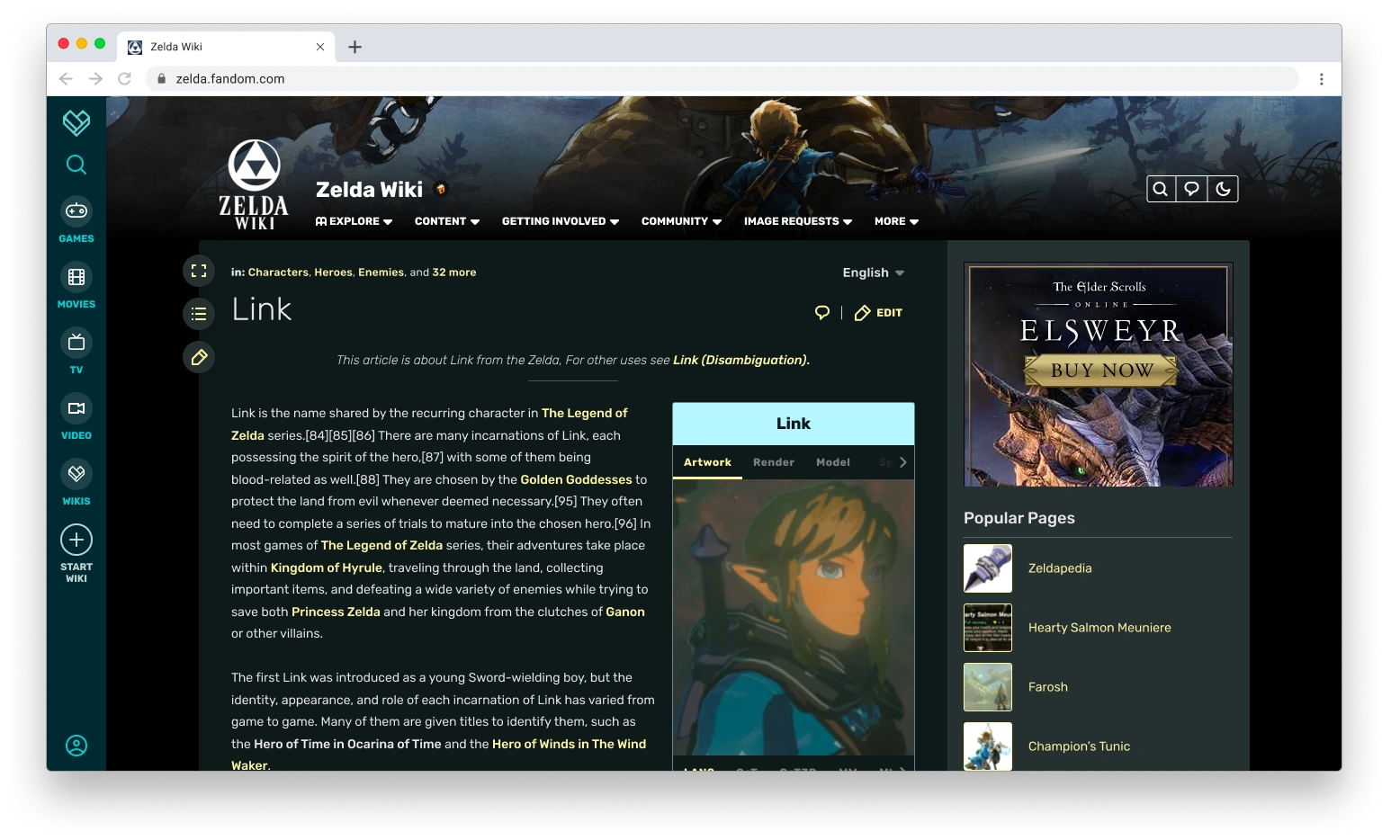
Every user consumes content in their own way and, to match that, FandomDesktop gives users more control over how they view the page even when logged out. We love how Gamepedia supports a light and dark theme, so we made that a foundational piece of the new experience.
Our new Theme Designer will allow you to customize both the light and dark themes for your wiki. While our mocks here use the same header image, the Theme Designer will allow you to have a different one for light and dark. Admins will also be able to set whichever version they want as the default theme for their wiki—the first time there’s been any optionality in default theming since 2010. We’re also adding native font support for custom headings, thereby allowing for more expression of the wiki’s identity.
We're also providing accessibility support when it comes to picking your colors for light and dark themes to ensure all readers can enjoy your wiki's content.
Ok, so what does the logged in user experience look like?
That’s another great question—you’re on a roll today.
On both Fandom and Gamepedia, the site looks exactly the same regardless of whether you’re logged in or logged out. Sure there’s some differences, like the ability to turn off most ads on Fandom and to earn the ability to do that with Gamepedia Pro, but that’s mostly it. In particular, the current look of Fandom was designed with a “one size fits all” approach where editors saw everything readers saw even if it wasn’t useful for them. Our experience over the years tells us that this isn’t the right approach, and that we should be finding ways where the logged in experience is more tailored to editors. FandomDesktop is very much a step in that direction.
Once you log in, here’s what the site can look like:
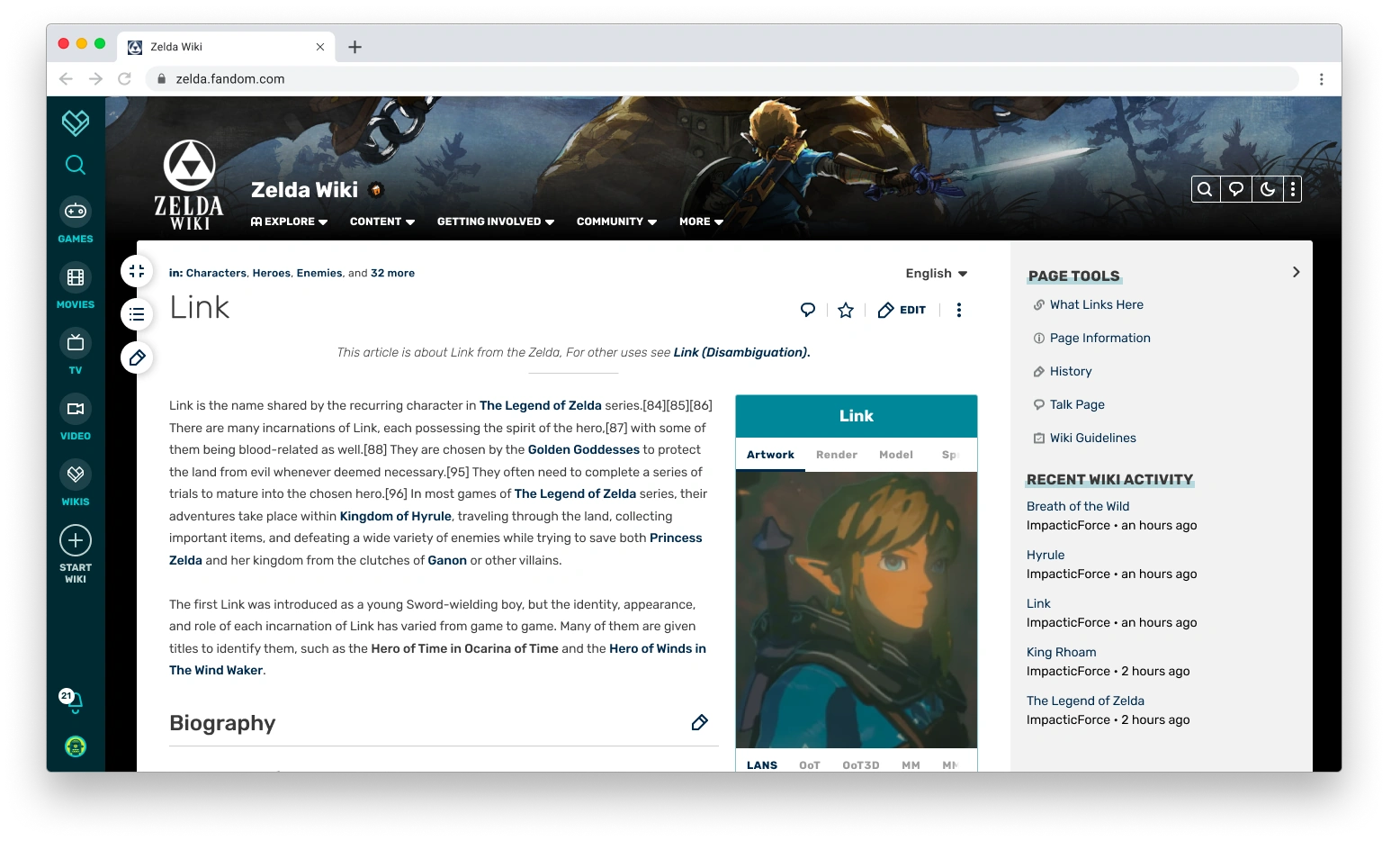
Let’s go through the key points here:
- Ad-free experience. As always, you can turn off almost every ad on the site. That won’t be changing, giving you a sleeker looking page that focuses much more on the content and much less on how it’s monetized. That monetization is important, otherwise we wouldn’t be able to keep the lights on or build new stuff, but you don’t need to see it. The value that you bring to the site makes up for any hit in revenue we get by not showing you ads in a way I can only sum up as infinity times Batman. It’s a lot.
- Editor-centric actions. Up in the top right corner, you see editor centric buttons like Create New Page, Recent Changes, Admin Dashboard, and - inside the additional menu - Add New Image or Add New Video. Most of these aren’t visible to logged out users, because they’re not as important to the logged-out experience. They’re for your workflow. You’ll also have easy access to toggle between light and dark mode.
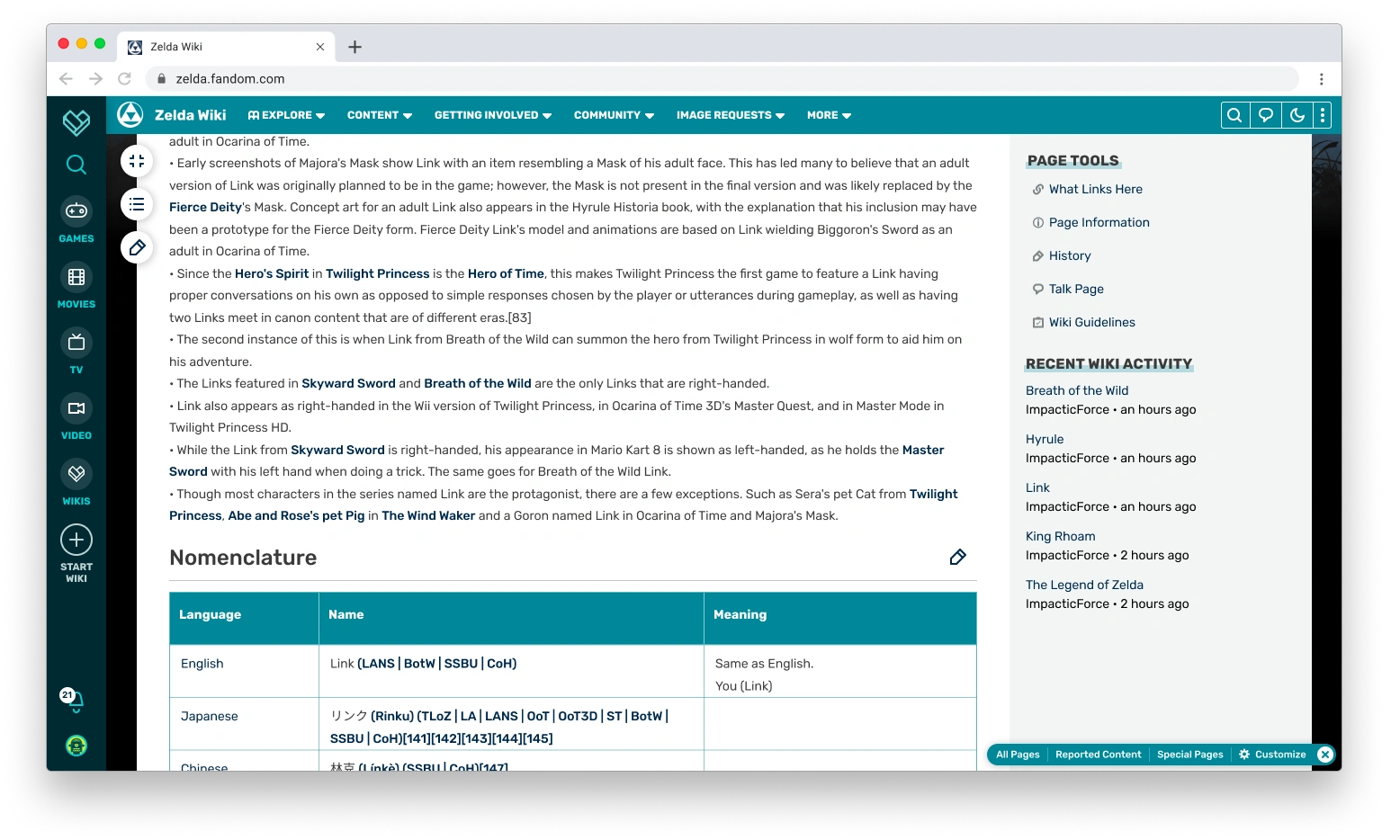
- Page Tools. You’ll see that the right rail now contains important page links and tools, with the quick access to things like What Links Here, History, Talk Page, and more. These will also be available options in your bottom toolbar, which will be part of the design despite not being reflected in this particular image.
- Preferred width remains intact. If you set the option to have a fuller width experience on the page, the site will remember that so you don’t have to toggle the expanded width on or off every time you view a page.
As you scroll, here’s what you’ll see:
As always, some key points:
- Page Edit button always within reach. Similar to the logged out experience, you’ll have access to both section editing and the page edit button regardless of where you are on the page.
- Shortcuts remain in reach. The local navigation also follows you down the page, so you’ll still have your navigation options.
- Tailored right rail modules. The more editing-centric and moderation-centric right rail modules will continue to follow you down the page.
- Redesigned Editor Toolbar. Here you’ll see the redesigned toolbar in the right-hand corner. We’ll do a deeper dive into this in another blog, including how it works.
You teased a really exciting announcement...
I did indeed. You may be thinking to yourself, what if I don’t want to see the right rail even with those additional page tools? What if I want even more space for the content on my screen? I told you earlier in this blog that I was going to tell you something that I think is the most exciting thing I’ve ever announced, and it’s the answer to those questions.
If you’re a logged in user, you will be able to set an account preference to collapse and hide the right rail. You will also have a toggle on the page to show or hide it. Here’s what the page will look like when that happens:
For the first time in over a decade on Fandom, you will be able to have a truly full width experience if you’re logged into your account. We can’t do that for logged out users—the right rail is a necessary vehicle for advertisements—but we are building this perk in for you. We’ve heard this feedback since 2010, when the fixed width experience became one of the biggest lightning rods in the Oasis skin. We heard it in user research studies with editors during the designing of FandomDesktop. We heard it from the Community Council. We particularly heard it from Gamepedia editors, who otherwise would have lost some of their screen real estate. And we heard it at Community Connect, where we promised to listen to feedback and incorporate what we could.
Long story short: we heard it loud and clear. This has been something that has been dearly important to Gamepedia editors and something we’ve heard a lot from Fandom editors, and we’re excited to be able to deliver on that with even more content width than Gamepedia. We’re still going to try to make the right rail more useful to you and hope you enable it, but we’re leaving that choice in your hands.
What does the page look like when I’m editing?
We want to make sure that the visual identity of FandomDesktop remains intact when you’re in edit mode. We’re striving to continue improving the editing experience, aiming to give you more space to edit while keeping core functionality close. The Gamepedia editing experience has done a nice job of providing you access to additional functionality outside of the editor toolbar, something we’ve carried over to the new design.
Check out the editing flow:
The most important points here are:
- Continued access to the local nav. When you’re editing, you may want to have easy access to another page. Right now that generally requires you to go to a new tab and return to the wiki. In this case, you’ll be able to open up important links in new tabs right away.
- Easy switching between editors. Moving between source and visual editing should be as simple as possible and that’s something we’re aiming to do here.
- Access to Page Tools. Just because you’re editing the page doesn’t mean you won’t need to be able to access some of the page tools. The editor will have a menu where you can continue to access those.
- More screen real estate. The editor container uses most of the screen real estate, providing maximum space to your editing workflow and matching the option to have a full width experience on the page.
What if I see things that could be improved?
The redesign isn’t the end of the story, but rather a new beginning. This new skin is a basis for which we can continue to make improvements. Some key areas we know could still be improved include:
- Iconography. We’ve had user feedback that some of the buttons are not clear to everyone. We will explore ways to hopefully make that clearer.
- Profile and Notifications. Early feedback we’ve gotten from members of the Community Council and attendees at Community Connect is that the profile and notifications menu being in the lower left with the new global nav is going to take a lot of getting used to and isn’t all that intuitive, given most sites do put those experiences at the top of the page. We have some exciting ideas on how to utilize this new global nav but need to make sure we get the basics right, so we'll continue iterating on it as needed.
If you think there’s something we’ve missed, let us know! We’ll be reading all of the feedback left on this blog. If your wiki has a Wiki Representative, you can send your feedback to them. If not, you can send us an email at community@fandom.com.
Timeline for the FandomDesktop release
FandomDesktop will become available as an opt-in and new wiki experience later this spring, with existing wikis moving to it as the default experience in the summer. We will have more specific timing in a later blog.
Next Steps
And so, gang, we’ve reached the end of this long blog journey of ours. There’s a lot more that I haven’t covered yet, either at all or in deeper detail. Over the next several weeks, more blogs will take a deep dive into topics including the Theme Designer, local and global navigation, article pages, editor tools, customization elements, and more detail about how community feedback has shaped this new design.
In the meantime, we invite your feedback in the comments!

Click here to follow the Fandom staff blog.
Click here to sign up for the From the Desk of Community email newsletter.
Join our Official Discord server for registered editors!